Create a graphic charter for your law firm
A successful graphic charter for a law firm must transcend simple aesthetics. It should reflect your unique identity, your approach to the law, and even, dare we say, a bit of your soul.
A successful graphic charter for a law firm must transcend simple aesthetics. It should reflect your unique identity, your approach to the law, and even, dare we say, a bit of your soul.
The distinction is often made through subtle nuances, your graphic charter is much more than a set of colors and fonts. It's your first handshake, your first argument without saying a word.
A successful graphic charter for a law firm must transcend simple aesthetics. It should reflect your unique identity, your approach to the law, and even, dare we say, a bit of your soul. Your potential customers are not just looking for a lawyer, they are looking for an ally, a personality, an assurance. Your graphic chart is the first clue to what they will find in you.
In the debate about the importance of graphic design, two camps often emerge: those who consider it secondary and those who devote extreme attention to it. Our position? Crucial, but without hampering action. Especially for lawyers, where trust is a pillar. Your charter should not be overlooked or incur exorbitant costs from the start. You must balance your investment according to your situation. Start with a strong and clear identity, then let it evolve and mature with your practice. Unlike other sectors such as transport or industry, in the world of lawyers, branding has a direct impact on the perception of your expertise and credibility. I invite you to listen to this podcast byOlivier Ramel, co-founder of Kymono, who talks about the importance of branding and its method for creating stylish boxes.
The graphic charter is much more than a set of aesthetic guidelines. It embodies the soul of your firm and influences how clients and colleagues perceive your brand. An effective graphic charter should:
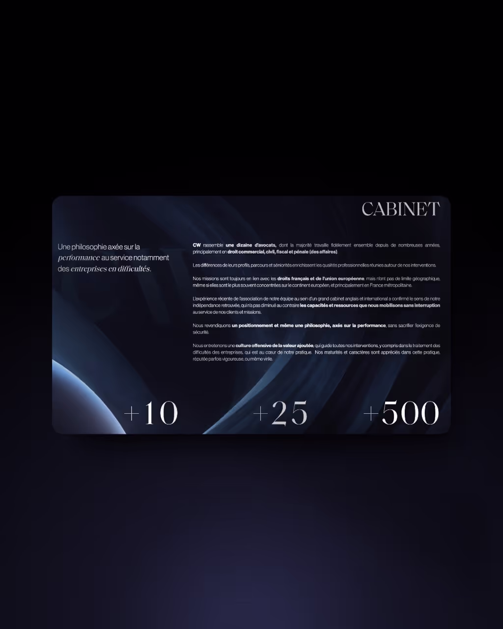
.avif)
Why choose a professional? For a sector like law, where trust and prestige are essential, a logo must be thought out and designed with care. A graphic designer or agency will bring expertise and creativity essential to create a logo that truly embodies the spirit of your firm.
The advantage of professional expertise: These experts can intuitively incorporate the nuances of your brand into the design, ensuring a result that is both unique and professional.
For DIY Lawyers: If you prefer to create your logo yourself, tools like Canva and Figma can be useful. They offer flexibility and ease of use for those who are less experienced in graphic design.
Limits of self-design: To make a mistake is human. But it is often committed by the most inexperienced. I remember my first logos, I was proud and now I throw up every time I see them. We tend to be proud of ourselves at the start and then our eye is refined when it comes to design and realizes that we are improving (or we stay with an ugly logo all our life).
Your logo should be effective both in black and white and in color. This ensures its versatility across a variety of mediums and contexts, including official documents, marketing materials, and digital platforms. When your colleague is going to use your logo on a terrible background and where nothing will be seen, you will be happy to be able to change it to white or black depending on it.
The logo should be clear and recognizable, whether from near or far away. This means avoiding overly complex details that can get lost when reducing the size.
A simple but impactful design is more likely to stick in people's minds. Avoid overloading your logo with too many or unnecessary elements. The Ourama logo is a good example here.
If you respect these rules, your logo can be adapted to various formats and supports without losing its integrity. Think about how it will appear on your website, business cards, stationery, and even on digital media like social media.
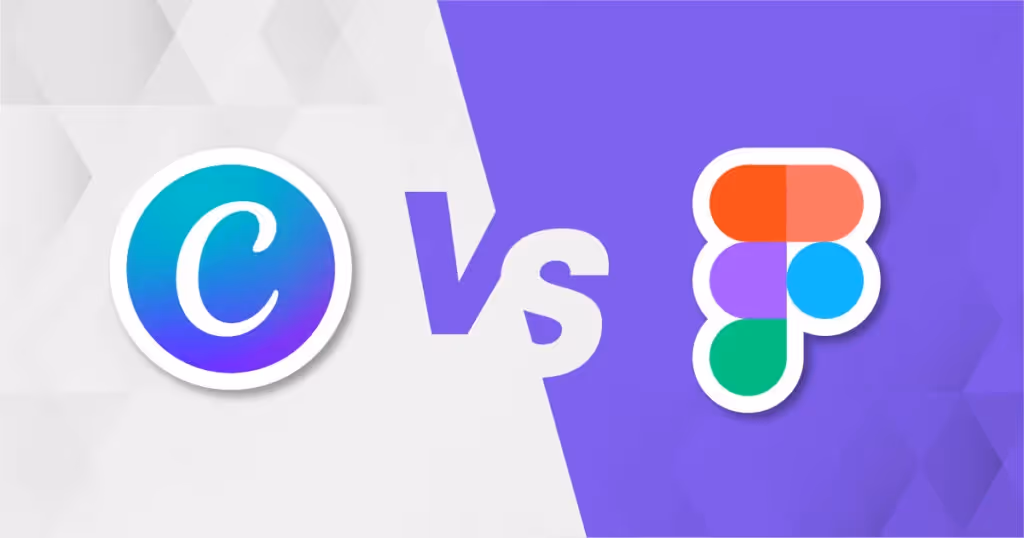
Once your logo and color palette are established, the next step is to integrate them into all aspects of your communication. This is where Canva or FiGMA become invaluable tools. If you suck at design, go for Canva, it's the most accessible tool. If you have a little artistic side, Figma will offer you endless possibilities. Ourama would not exist without Figma. And when we develop a design for a client, we then redo it on Canva so that they can modify it as they wish.
Canva and figma are intuitive platforms for creating visual supports consistent with your graphic charter. Whether for brochures, business cards, or your website, they allow a homogeneous variation of your visual identity.
Take advantage of the many templates available on Canva and the Figma community (which has a lot of taste), customizable to adapt to your graphic charter. This not only saves time but also ensures compliance with the aesthetic standards established by your logo and color palette.
Canva is designed to be accessible, even for those who don't have advanced graphic design skills. This makes creating visual materials less daunting and more affordable. Figma is also free but is more difficult to learn.
Canva & FiGMA also make it possible to create multimedia elements, such as presentations or social media content, which are essential for maintaining a consistent and professional online presence.

When designing a graphic charter, there are several pitfalls that are easy to fall into. Here are the most common mistakes to avoid:
A common mistake is the lack of coherence between the various elements of the graphic charter. Make sure your logo, colors, and typography harmonize and communicate a unified message.
Avoid overloading your design with elements that are too complex or too numerous. A graphic charter should be clear and easy to understand to remain effective and memorable.
While it's important to be up to date with current trends, complying with them blindly can make your graphic design outdated quickly. Your design should reflect the unique identity of your firm, not a passing fad.
Simplicity is the key to a successful graphic charter. Designs that are too complicated or overloaded can not only be difficult to replicate, but they can also draw attention away from your core message.
Not taking into account the opinions of your customers and your team can cause you to miss out on important perspectives. Constructive feedback can help refine your graphic design so that it better resonates with your audience.
Often, the design of a website is accompanied by the creation of a graphic charter. At Ourama, we understand that creating a graphic charter is a personal process for each law firm. And what's more, we love it.
It all starts with a thorough interview with you. We take the time to understand who you are, what you do, and what you love. This is accompanied by a detailed questionnaire to better identify your expectations and preferences.
From this first meeting, we develop a moodboard. This tool helps us to bring your ideas to life and to give a clear visual direction to the project.
Based on the moodboard, we develop several logo and graphic charter proposals. Each proposal is designed to reflect your unique identity and meet your specific needs.
We present these proposals to you, and together we identify the “winner.” If necessary, we explore new paths until we find the ideal graphic charter. We warn you: there is a cost to go back and forth. Indecision comes at a price, but in general, there is often a match from the first presentation!
Once the choice is made, we develop a complete brand block including your logo and your graphic charter in all their forms. Our objective is to create a simple graphic charter that is easy to share with your partners and not too restrictive for you.