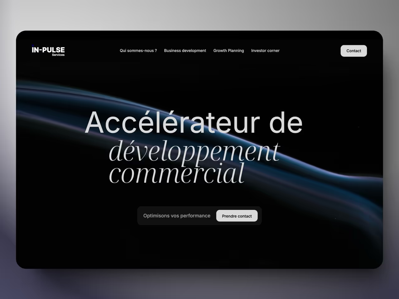


When Freddy Branco called on us, he had a clear ambition: to create a complete visual identity and a website that reflects his project and his image: modern and impacting. The main challenge? Present as much information as possible on a single page without making it difficult to read. Make the site modern, clean and engaging at the same time, encourage visitors to take action.
Freddy wanted a strong identity that embodied both his vision and the essence of his business. The name of was already existing and a charter had to be built around it. So we worked from this name to create a complete graphic charter.
We opted for thick and striking typography, so that the name “IN-Pulse” would remain etched in the minds of visitors. Simplicity and modernity were at the heart of our thinking. The logo includes a stylized lightning above the “I”, used as a dot, evoking both energy, dynamism and the idea of rapid development. This subtle and harmonious graphic detail gives a modern and original dimension to the whole, while avoiding the classic cliches of arrows or curves overused in advice. In addition, this logo can be reused alone on various communication media!
The logo was also designed to evolve dynamically on the site, reinforcing the idea of adaptability and tailor-made expertise. As the page is scrolled, the word “Service” in the logo is gradually transformed: first into “Business Development”, then into “Growth-Investor”. This animation highlights In-pulse's ability to precisely meet the needs of its customers at each stage.
In terms of colors, we opted for a electric blue to embody modernism and reliability, while establishing a serious and professional image. This bold choice provides a strong and easily recognizable visual identity.
Initially designed entirely in “dark mode” with touches of electric blue, the site has evolved to integrate, little by little, sections White. The result is a harmonious blend of dark and bright sections, creating a dynamic and engaging visual rhythm. This alternation makes it possible to clearly mark the transition between the different sections, while highlighting key information in a clear and impactful way.
Subtle animations accompany these transitions, reinforcing the idea of movement and evolution. These animations bring an ultra-modern dimension, while naturally guiding the user through the page. Each section thus invites you to continue browsing, offering a smooth and pleasant experience, without visual overload.
This structured and lively design also guarantees optimal readability, even with a large volume of information. With well-thought-out contrasts between dark mode and bright sections, and cleverly distributed blocks of content, visitors can quickly identify important information, while being encouraged to explore the site further.
The site is also designed to encourage engagement, with Calls to action strategically placed. A wording that is both technical and reassuring, highlighting the expertise and clarity of the support offered by IN-Pulse. All encouraging visitors to make contact and start support with confidence.