The importance of responsive design for my law firm's site
In France, 65% of search engine traffic comes from a mobile phone. Even if the use of telephones seems obvious when creating a website, there are still far too many law firm sites, which do not take this into account, or who do not know why it is absolutely essential to have a “responsive” site.
Responsive web design
A responsive website means taking into account when designing a site that it must be able to be displayed fluidly and in the right format on any type of screen. It is important to keep in mind that the users of your website do not all use the same screen size, whether it is a computer screen or a telephone. Your site must be adapted to absolutely all types of screens. For obvious reasons and others not so much:
The importance of having an adaptive site
For users : You worked hard on the design of your site without taking into account mobile responsiveness. The images take up half the screen, some texts are not visible, navigation is complex or sometimes even impossible. As a result, the first impression of many users on mobile is bad and they leave your site immediately. A non-responsive site has a direct impact on your conversion rate.
For you : an unsuitable website can damage the image of your firm. A prospect who comes across a site that is not functional because it is not designed for its type of screen may see a certain lack of professionalism. Having a website is an excellent tool to improve your credibility, it would be stupid if the effect were the opposite.
For search engines : The “Mobile First Index” is the name that Google has given to its method of indexing sites. In order to offer the best experiences to users, Google brings the mobile version of your site to the forefront in its SEO algorithm! To put it simply, if you want to be the first on the search engine results you need a site designed for mobile and desktop.
The content also
Through your own experience, you are aware that browsing on mobile is not the same as browsing on a telephone. In addition to design, there is also work to be done on content. Avoid even more textual areas on mobile. Mobile users are often looking for quick solutions, we spend almost 2 times less time on a site from our mobile compared to the same site on our computer.
The mobile user is therefore more quickly frustrated. For example, filling out a contact form may be impacted depending on the device used. Someone on mobile will be less likely to fill out a form that requires too much information while a computer user will have a higher patient threshold.
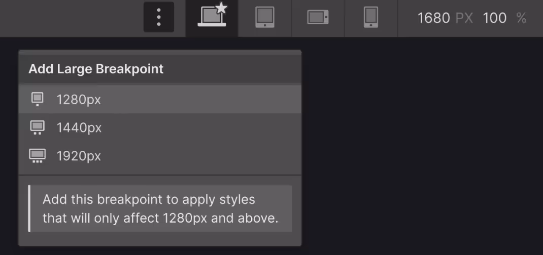
Breakpoints: Designer by device (Webflow tutorial)
In web design, a breakpoint is the point where the content of a website adapts to meet different screen sizes.
How to technically create a responsive design with Webflow
Define the required breakpoints: Webflow offers five breakpoints by default (Base, 991px, 991px, 767px, 479px, and 319px). These values correspond to common screen widths: from large computer screens to the smallest smartphones.
Adapt the layout: Start by designing your site for the basic view (usually the desktop). Then, adjust the design for each breakpoint. Webflow makes this process intuitive by allowing you to select the desired breakpoint and modify the layout, typography, and other style elements directly in the interface.
Use Flexbox or Grid containers: For maximum flexibility, use Webflow's Flexbox or Grid containers. These tools provide precise control over element alignment, distribution, and spacing, which is crucial for successful responsive design.
Test and adjust: Use Webflow's preview feature to test how your design behaves across devices. Feel free to go back and adjust breakpoints if necessary. The aim is to achieve a balance where content is legible and accessible on all screens.
Optimize images: Make sure your images are optimized for the web and that they load properly on all devices. Webflow provides options for defining different versions of an image for different breakpoints, reducing load time on mobile devices.
Attention to Details: Elements such as navigation menus, buttons, and forms also need to be adapted to different breakpoints. For example, a dropdown menu on desktop can be transformed into a hamburger menu on mobile to save space.
Responsive design is an iterative process, requiring continuous adjustments and testing to ensure that the user experience remains consistent and engaging, regardless of the access device.
For more practical advice, we have created a free guide that will help you create, alone or with someone else, your law firm's site.
Nous utilisons des Cookies pour mesurer l'audience de notre site internet. Vous pouvez vous opposer aux traitements basés sur l'intérêt légitime à tout moment en cliquant sur 'Refuser'. Pour plus d'informations : Politique de confidentialité


