The 100 most beautiful law firm sites in 2025
Discover a non-exhaustive selection of original French law firm websites to inspire you in creating your own!
Discover a non-exhaustive selection of original French law firm websites to inspire you in creating your own!
We review more than 1000 law firm websites per month. 90% of the websites look the same and are copies of the neighboring colleague's site. However, some stand out from the crowd and offer creative websites. With this in mind, we created our list of the 50 most beautiful website designs for law firms.
Rather than displaying them one after the other, we preferred to create a dedicated list that includes more than 100 websites made by talented designers. Click below to download the rest of the list of the 50 most beautiful lawyer websites.
To inspire lawyers who want to create their website: Creating a website can seem daunting, especially when you don't know where to start. Our list was designed to be a source of inspiration for those who are looking for ideas. By taking a look at the best designs and features, you can better visualize what you want for yourself.
Start on a healthy basis: Good design is much more than beautiful images. It's about combining wording adapted to your strategic goals with a pleasant user experience. Bring a visitor into your world, make people understand your assets, what you bring, how you help your customers. And redesigning a poorly designed site can cost more than starting from scratch. By presenting the most beautiful lawyer websites, we want to show others how to build a solid site from the start.
Differentiate yourself: The competition is fierce. A well-designed website not only makes it possible to stand out, but also to show a professional and modern image. By opting for innovative and creative design, lawyers can assert their authenticity in the sector. For tDownload the complete list here!
The sites were not chosen purely subjectively; we used a combination of several criteria.
Navigation : One of the most important criteria was ease of navigation. A site should be intuitive and allow the user to quickly find the information they are looking for, whether it's details about the services offered, testimonials, or contact information.
The design : We were looking for sites that were not only functional, but also aesthetically appealing. An aesthetically designed lawyer site reflects the professionalism of the firm and inspires confidence in potential clients.
Creativity : Sites that offered unique elements—whether in design, animations, or features—caught our attention.
The assumed positioning of lawyers : Finally, we have taken into account the message that law firms want to convey. A site should reflect the mission and values of the firm. Those who did it with conviction and clarity stood out.
Chez Ourama, we are committed to promoting excellence. This list is the result of meticulous work and reflects what we consider to be the pinnacle of design for lawyer websites. If you are a lawyer looking to improve your online presence, This list is for you. It will provide you with the tools you need to understand what works, inspire you, and ultimately stand out.
Know that we are able to create equivalent sites, and you will find some of our creations inside. For tDownload the complete list here!
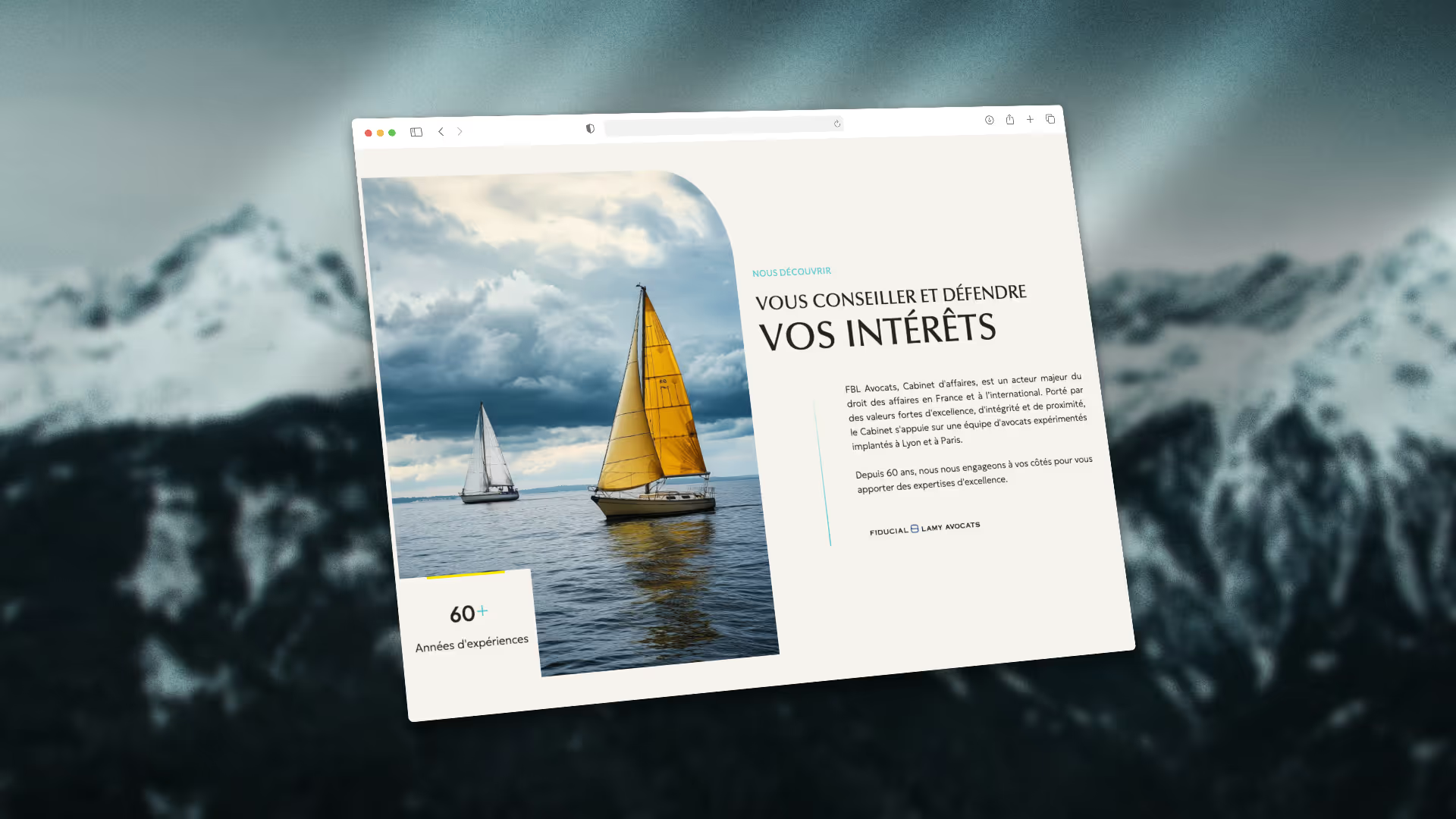
As a result of the transformation of Fiducial Legal in FBL Avocats, the firm has completely redesigned its website, in order to align it with its new identity and reputation. Each element has been designed to reflect the rigor and precision of the firm.

Our collaboration with Anima Dispute Resolution, the arbitration firm founded by Thomas Granier and Jacob Grierson, has resulted in a creation that combines simplicity, elegance and modernity. We designed a clean and intuitive website, featuring a refined aesthetic that reflects the professionalism and excellence of the firm. Contemporary design touches underline their commitment to innovative arbitration solutions, while ensuring a smooth and enjoyable user experience.
%25252520-%25252520Moyenne.avif)
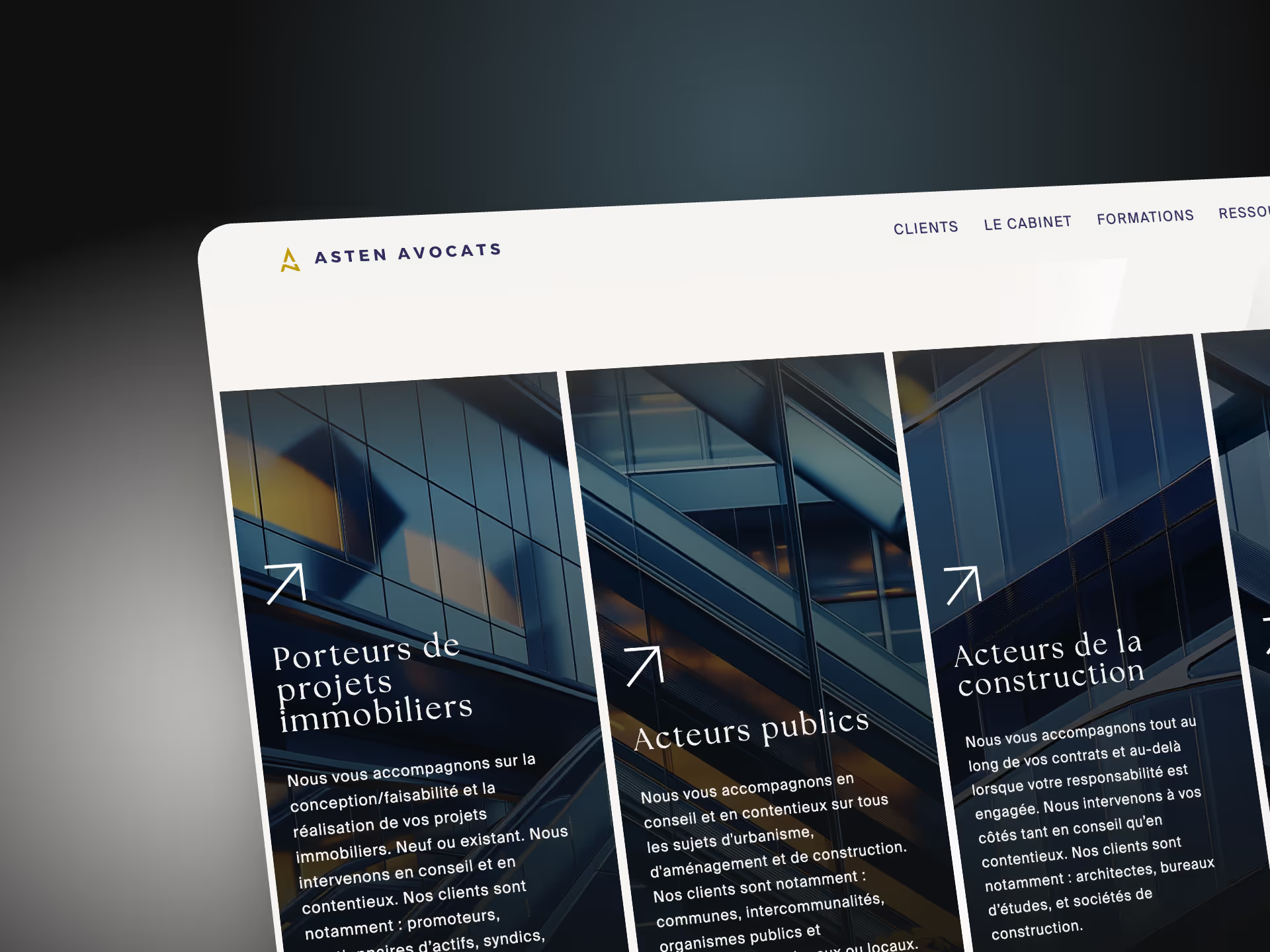
The site of Asten Avocats is distinguished by its innovative section navigation and a particularly well achieved aesthetic. The clean and modern interface offers a smooth user experience, showcasing the firm's services with elegance and simplicity. For tDownload the complete list here!

The Elliot BZH site is distinguished by a hyper-creative design. Lawyer in Saint Malo, expert in debt collection, real estate seizures, judicial sales, legal sales, licensing, companies in difficulty decided to completely differentiate themselves with an atypical design and play the originality card! And it works!

Rather than displaying them one after the other, we preferred to create a dedicated list that includes more than 100 websites made by talented designers. Click below to download the rest of the list of the 50 most beautiful lawyer websites.