Inspiration and tools to create your law firm logo
Discover where to find inspiration for your law firm logo, and the tools to create your lawyer logo.
Discover where to find inspiration for your law firm logo, and the tools to create your lawyer logo.
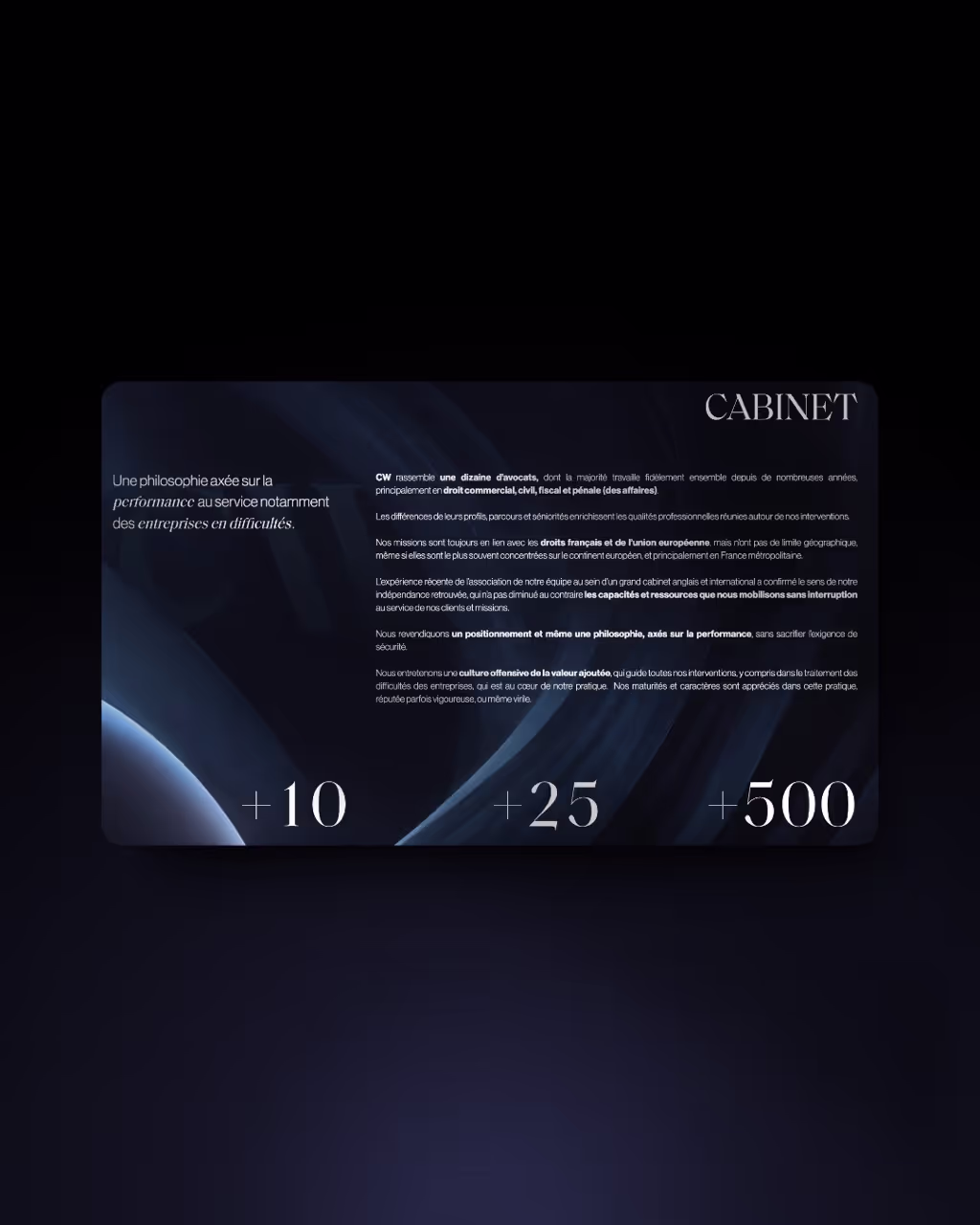
Your firm logo is the first visual element that clients will associate with you. It is the visible side of your office, the reflection of your work. A logo shouldBe in the image of your firm, occupational, inspire trust, you differentiating from other cabinets, and ideally sharing emotions and values specific to the firm. Your logo is also An authority argument. A strong and recognizable logo impacts your image, the level of trust and credibility that customers or potential customers give you.
Make sure your logo is legible (especially if you choose a logo with the name of your firm). Vectorize your logo ! That is to say a format that allows enlarge it without losing quality. If you need to enlarge it one day, for a poster for example, this will avoid having a large fuzzy pixel. Make a logo that can be reused on various supports. A logo for your site is good. An easily reusable logo on your social networks, your email signatures, your brochures, documents,... It's even better.

You can put one color not 15, you can put 2 colors not 15,... In general maximum 3 colors for a logo. The ideal is one or two. The advantage of a monochrome logo is that it is available in several colors. Consider making several colors for your logo in order to adapt to the different backgrounds on which it is intended to be used.
Even if you choose a logo with colors, Do a black version and a white version of your logo is essential. You may sometimes encounter constraints with a colored logo (printing for example).

In the majority of cases, law firms opt for between A letter, initials, name, or symbol. Free, it's up to you to choose, everyone knows their strengths and weaknesses. The name Allows you to be easily identifiable and to build a visual identity when you are unknown or little known. However, it is not easier to reuse on your various communication media.
The graphic sign Let him be feasy to use, to have a unique style, of sharing emotions or things deeper than text and if you already have a strong identity, to be quickly assimilated to the symbol. You need a version where you associate the name and this element. It is also ideal at the beginning to create your identity.
The letter or initials is a good alternative to be identifiable and offer a unique and stylized design.
Keep it simple. The trick is that your logo should be able to be fEasily redesigned. A logo that is too complex with too much detail will quickly be forgotten and completely out of fashion in a few years. With a simple logo, a facelift every 5 years and you're good to go.
You can try to complicate a logo and add details that will only be perceived later or by the most observers. But be careful with the forms that are created unintentionally. Check your logo in all directions to avoid slips.

The first obvious source of inspiration is The brands that surround yout. The second: The logos of your colleagues. We do not invite you to copy an identical logo that you like, you may have problems. But collecting as much information as possible to already realize the graphic possibilities, which is beautiful and especially the mistakes not to be reproduced (at random: a scale for example...)
There are several sites that bring together community creations that can inspire you:
No surprise the simpler the tool is, the more limited you will be in terms of creativity. For prices, there is no correlation between the limitations of the software or the ease of use. Prices vary.
👇 We recently made a “top 10 of the most beautiful law firm logos”. Enough to give you ideas! We let you discover that by clicking on the button a little lower. 👇