Top 10 law firm logos
The most beautiful law firm logos! Discover our top 10 lawyer logos
s
s
g
u
z
d
d
g
The most beautiful law firm logos! Discover our top 10 lawyer logos
Not easy to choose only 10 law firm logos, because even if a Top 100 ugliest would have been simpler, there is all the same Quite a few cool logos. Joke aside, it is difficult to discover them all, and there is bound to be A part of subjectivity. So, for any complaint, blame the author...
Choosing a logo and creating it for your office are determinants. It's about The image of your office, the construction of visual identity of your brand starts here. More than one symbol Or the name of your firm in original typography, it's about the representation of values and personality of the cabinet. And some people understood it well:
The minimalist logos par excellence, since it is simplyA letter or initials from the firm. But minimalism does not rhyme with soulless and does not prevent being designer. Timeless and very practical to highlight it in your semail signatures, website, LinkedIn, or communication,...
For example, let's take the firm logo August Debouzy. The letters A and D intertwine with a choice of typography soft and sober. One reassuring, corporate and modern side. Congratulations to the agency Eliott & Markus for their work here!

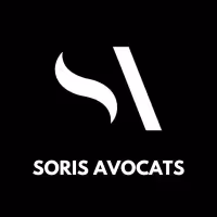
For Soris Avocats, same recipes with an S and an ultra-minimalist A using geometric shapes And where the CBrain takes care of the rest. It is simple, beautiful and original. At the limit of the abstract typographic logo that we will tell you about later in the top. The letters here remain relatively easy to identify. In any case, we like it! Congratulations to the studio Section 4 for their work!
A logo made up text only, with a typology carefully selected. Useful if you don't have too much inspiration or are not a fan of a logo symbol. The idea is still to propose an original typology and design to stand out from the crowd. Problem : if you have An extended firm or family name, we recommend that you Take your turn for this type of logo.
The example of the Bold logo, a typeface in”greasy“(bold) All in all logical. Although I am sure that some did not make the connection.
.svg)

Bonus point if you change your logo by logolettes ! It is simple and practical to take advantage of the advantages of logolettes. The Netflix logo for avocados!


Hoalen Lawyer In a style manuscript but with the same strategy as Bold. And with the Or turned into a logo. Produced by the team Rivacom !
Mix letters and symbols, with more or less identifiable symbols. Logos that can be guessed.
.svg)
The Stehlin Avocat logo can be guessed. We first see a square formed by a river and two pieces of land at each end and then we guess the S after a few seconds. This type of very modern logo can then be divided into several parts and the forms reused in the visuals (as in the background of the site ofOcéane Stehlin)

Squadra Avocats, a square with blue shapes subtly drawing an S. It's square so it's pro! In any case, this is what a lot of people must subconsciously feel when facing the logo. Whatever it is, the S can be guessed When we Learn the name of the firm and that's great.
No letters just a symbol, finally a real logo, which is rare for a firm. Allows you to Transcribe things, Emotions What of logoletters or logotypes can't necessarily do. This allows for a truly unique identity.
The logo of the firm Archers, made up of 5 arrows, is abstract. It is an extremely effective logo which refers to the name of the firm and is easily adaptable In visuals and above all, that we remember. Congratulations on this logo.

The firm's logo Alerion Attorneys, an eagle represented with geometric shapes And who in addition is animated on their website. That in throws, respect the logical From the name of the firm and so that in makes a great logo.

Samurai blue, Does the logo hide a B and an S through its blue shapes? Certainly. A shuriken with a white background? Maybe. Hard to say, but the result is successful and does not leave anyone indifferent. The logo seems simple at first glance, then you look at it again and get caught up in it. a kind of spiral with blue and white corners.
We wanted to come up with the top 34 law firm logos where they all look the same and are clearly far from being original.
So it's the end of this top 10 with only 9 logos. We hesitated for a long time between several for the tenth. That of PicArt Avocat, Orwl_, Rivière Avocats, Inititia Avocats, and many others... So we prefer to ask you: what is your favorite logo that deserves to end this top? (ps: and to create your logo, call us!!!)