

The PGA Cabinet, founded in 2015, is specialized in M&A/Private Equity, corporate law, tax law, Restructuring and social law. Initially focused on the M&A/Private Equity And the Corporate, the firm has gradually expanded its expertise by integrating teams dedicated to tax law, at social law And at Restructuring.
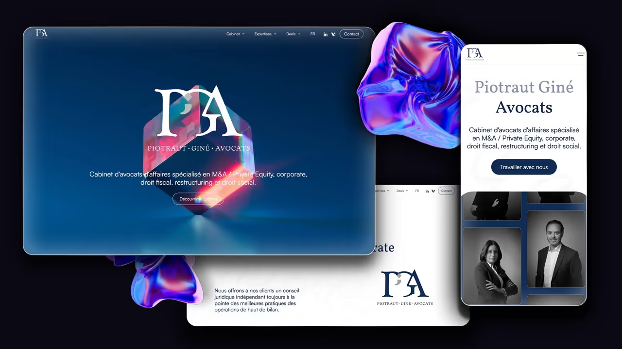
Faced with a website initially designed on a single page, which brought together a multitude of information and no longer reflected the growing size of the firm, PGA turned to us for Redesign its site and toughen its reputation.

To adapt to the evolution of its services and better represent the diversity of its expertise, the PGA firm has completely renovated its website. From a simple landing page, it went to a complete showcase site, structured around a dedicated page for each expertise, thus offering a detailed and specific exploration of its areas of intervention.
The site also includes a rich and dynamic blog Who highlights all teams and each member of the cabinet, creating greater proximity and transparency with customers. In addition, a special section of the blog is dedicated to 200 deals milestones achieved by PGA, offering an open window into the success and experience accumulated by the firm.
For the design of the new PGA website, we opted for an aesthetic refined and timeless, in order to create a digital space that reflects the precision and professionalism of the firm. By playing subtly with the Semicolon of the logo, we have injected a unique and recognizable visual identity into each page of the site. This graphic signature is available by expertise, thus reinforcing the uniqueness of each domain while maintaining a global coherence. It is also found as a watermark of the site on some pages. This design minimalist, combined with smooth navigation, aims to offer a optimal user experience, putting the skills of the firm without superfluous distractions.